Icon Set

Role
UI Designer
Teams
Product
Tools
Figma
Overview
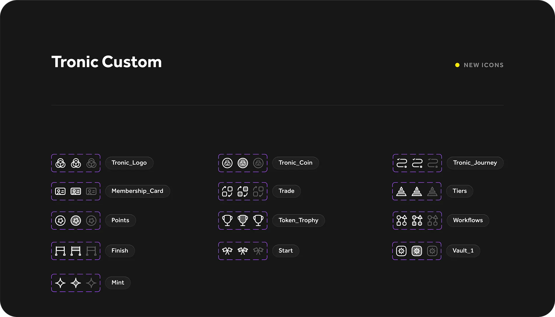
Tronic needed a custom icon set that felt unified, versatile, and aligned with the platform’s evolving design system. The goal wasn’t just to make icons — it was to create a scalable, systematic set that felt at home in both product UI and brand communication.
This icon set became a foundational asset across the product ecosystem, supporting navigation, tooltips, modals, and more.
Discovery
I began by auditing existing icon usage across product, marketing, and design files. Key findings:
Inconsistent weights, styles, and proportions
Multiple third-party sets mixed together
Limited visual harmony between icons and typography
These inconsistencies made the interface feel disjointed and introduced unnecessary visual noise.
Design Principles
To ensure visual harmony and system consistency, I defined core design rules:
Stroke weight: 1.5px for optimal legibility at small sizes
Corner radius: Soft, geometric rounding for approachability
Proportions: Based on a consistent grid and center alignment
Style: Minimalist, slightly playful, with balanced negative space
This structure helped streamline future additions while keeping everything feeling cohesive.
Execution
I created the icons in Figma using a 24x24 grid and built reusable base shapes to ensure consistency across the full set. Each icon was tested at various sizes and against both light and dark backgrounds.
The final set included: ✅ Navigation icons
✅ System/status indicators
✅ Feature-based icons
✅ Utility shapes (arrows, checkmarks, modals, etc.)
Final Delivery
I organized the icons in a shared Figma library with:
Variants and naming conventions for easy dev handoff
Documentation on spacing, alignment, and best practices
Usage recommendations for different contexts (nav, modals, cards, etc.)
Impact
Reduced reliance on third-party libraries
Increased UI cohesion across product and marketing
Simplified design-to-dev workflow with pre-aligned, scalable icons
Created a visual foundation for future design system enhancements
Reflection
Icon design is where system thinking meets pixel precision. This project reminded me how small elements can have big impact — not just visually, but functionally. A well-built icon system improves UX, dev workflow, and visual trust.