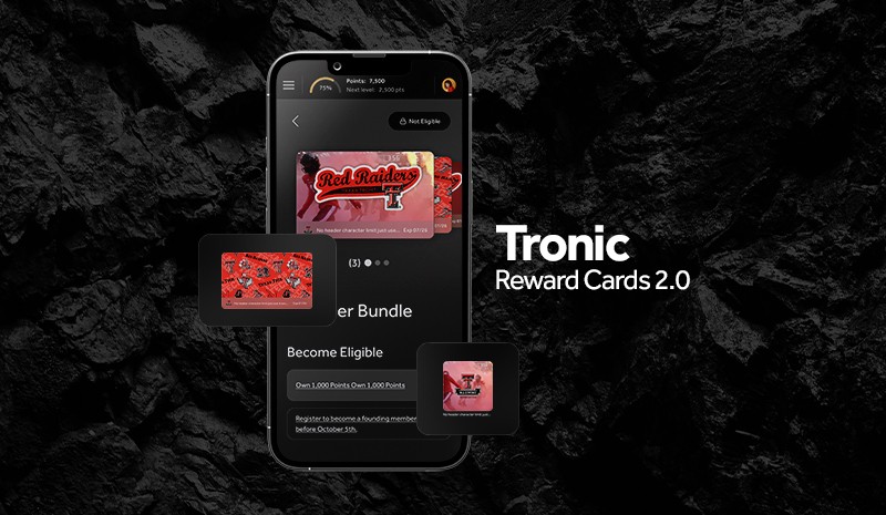
Reward Cards 2.0
Role
UX Designer
Teams
Product, Engineering, Customer Delivery
Tools
Figma
Overview
As Tronic's Reward Card feature became central to client engagement, visual inconsistencies and structural gaps were limiting its scalability and usability. With the introduction of a new design system, I led a cross-functional effort to align the component with updated standards while also improving the authoring experience for clients and usability for end-users.
Goals:
Align reward card UI with the new design system
Streamline the creation process for client users through reusable, flexible templates
Reduce internal reliance on custom card builds by enabling scalable customization

Discovery
I initiated input sessions with product, engineering, and customer delivery teams to understand friction points from both the client-facing side and internal implementation perspective. I also conducted a functional UX audit of how cards were displayed in both the wallet and discovery contexts.
Key insights:
Existing reward cards lacked visual consistency and had unclear metadata hierarchy
Client users needed more flexibility and guidance when designing cards
Internal teams were often manually creating or fixing cards for clients, creating bottlenecks
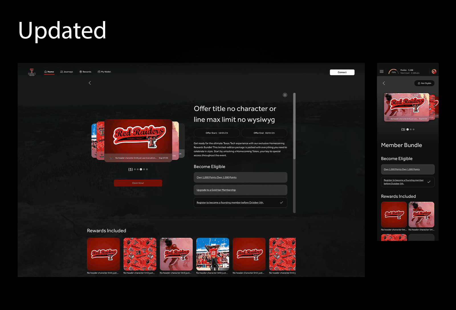
Strategy & Ideation
I led the ideation of a modular component system for reward cards, ensuring it supported a range of configurations while staying consistent across screen sizes and themes.
Considerations included:
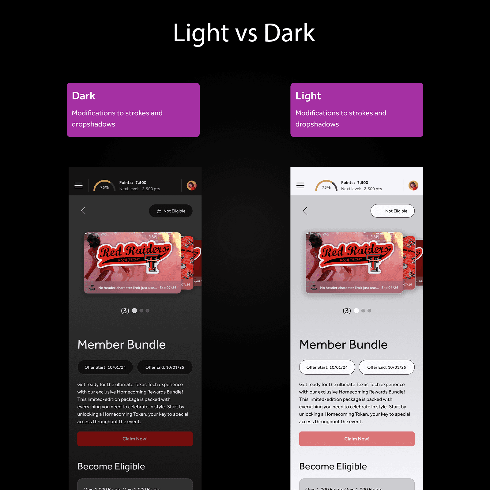
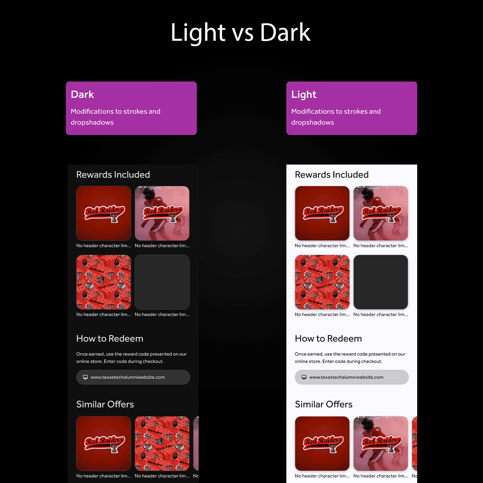
Light/Dark mode compatibility
Variable presence of logos, expiration dates, headers, and images
Card size variations (small vs. full-size)
Structural integrity within design tokens and system constraints
I prioritized configurations based on client needs, engineering feasibility, and future use cases within the platform.


Cross-Functional Execution
Throughout the project, I collaborated closely with engineering to ensure feasibility early in the process. I also worked with our customer delivery team to ensure that the cards could be easily adopted by clients using the Studio editor.
We conducted rapid feedback loops using async reviews with stakeholders and internal testers. I also defined spacing, tokens, and logic requirements to simplify implementation and reduce ambiguity during dev handoff.
Delivery & Outcomes
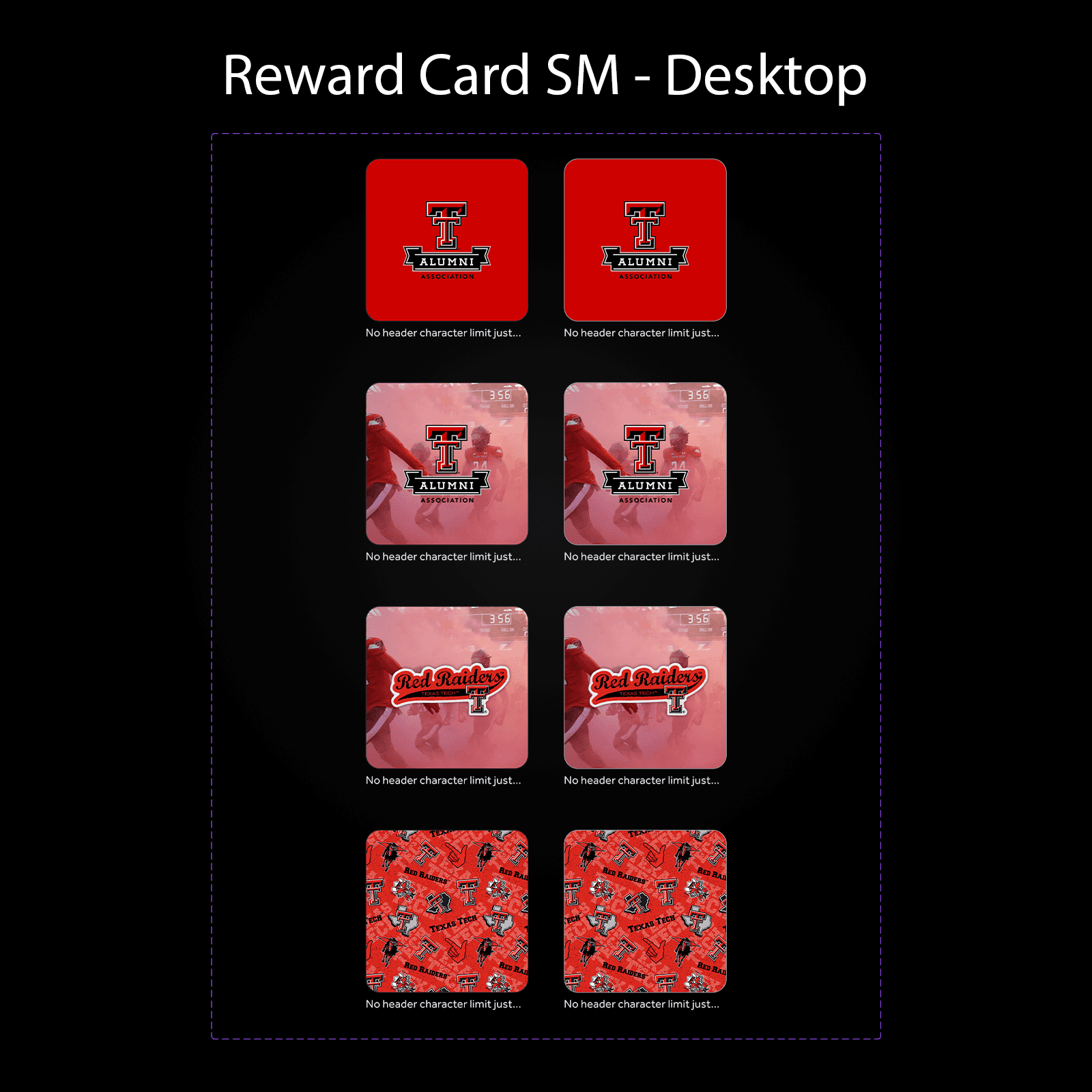
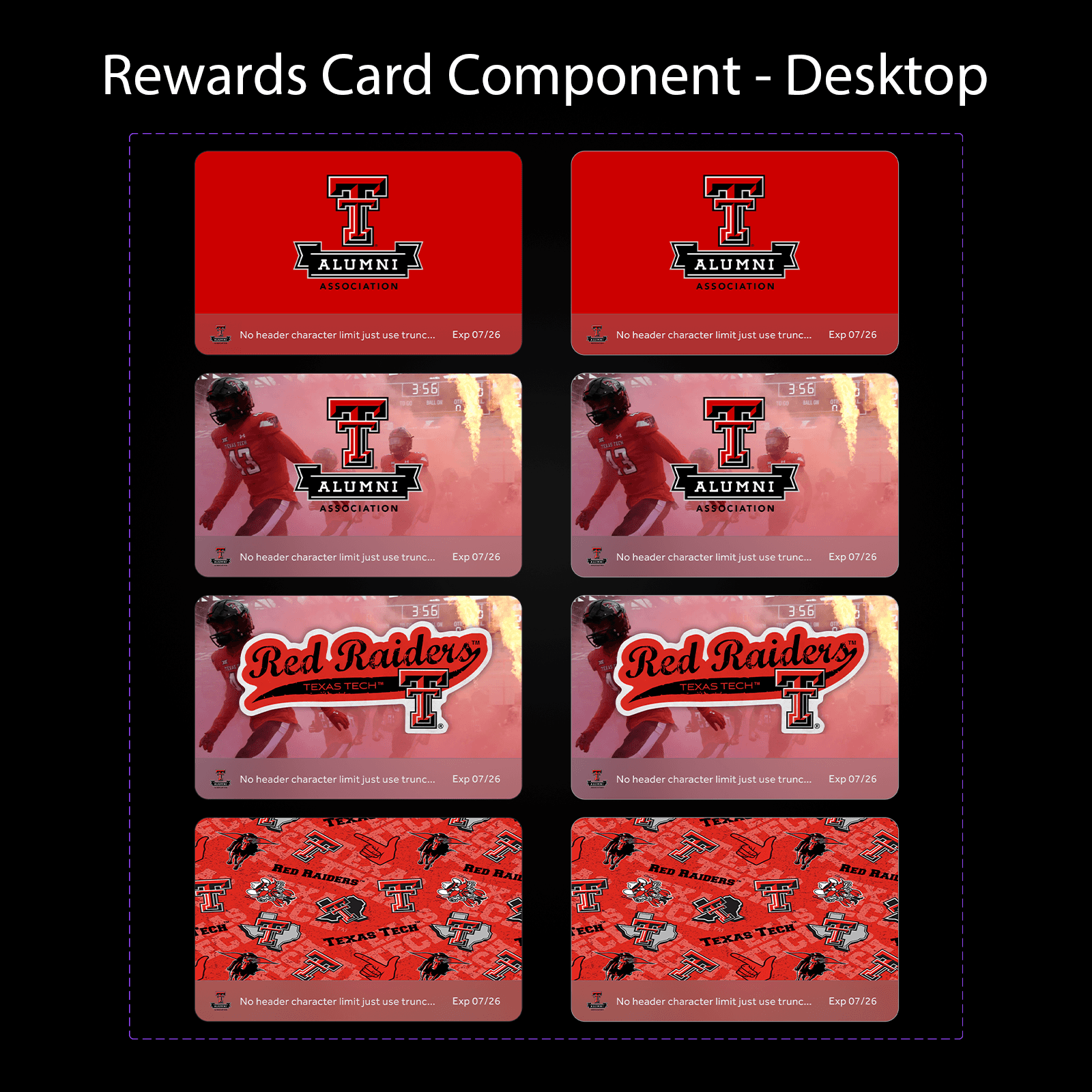
The final system included:
A scalable component library with pre-defined variants
Prototypes in both light and dark mode, responsive across desktop and mobile
Usage documentation and customization guidelines for internal and client use
A new square card format for use within dynamic content feeds
Impact
Reduced support dependency by enabling clients to build cards independently
Improved consistency and visual hierarchy across all reward surfaces
Established foundational UI patterns adopted in future Studio features

Reflection
This project taught me how to balance client-facing flexibility with internal consistency at scale. While my role was design-focused, I operated in a product mindset—navigating constraints, synthesizing cross-functional feedback, and prioritizing outcomes for both users and the business. It deepened my interest in strategy-focused work and helped me identify where I thrive: in the messy middle between structure and creativity.
